Usage
When to use
- To navigate to a new destination, either internally or externally.
- Within a block of body text or other text element.
When not to use
- As a standalone element, consider Standalone Link.
- To trigger an action or event, like a form submission, consider Button.
Usage in Figma
The Inline Link is only published as a component in Ember, there is no corresponding Figma component. To achieve the same results:
- Apply a text style and color variable to a block of text from the Foundations v2.0 library under Text styles >
BodyorCode. - Select the word or phrase that is intended to be a link and apply either the
primaryorsecondarycolor fromComponents / link-inline / foreground. - Change the text decoration of the intended link to "Underline".
Color
Primary
We recommend using the primary variant as the default and for more important links.

Secondary
Use the secondary variant for less important links or when the primary link can’t be used.

Don’t mix primary and secondary links within a block of text or adjacent blocks of text. This can lead to confusion about the hierarchy of the links and their relative importance.

Icon position
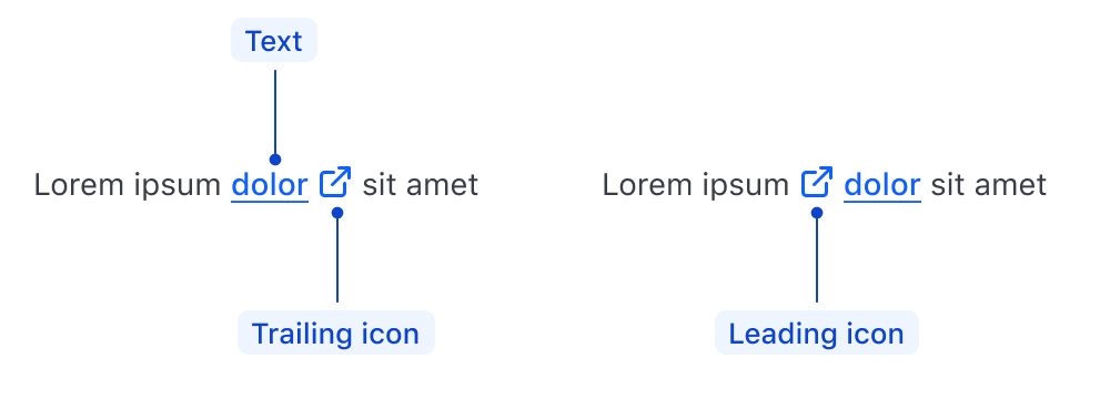
An Inline Link can include a leading or trailing icon in the Ember component. Avoid creating links with both leading and trailing icons.
Trailing
In most cases, use trailing icons as this breaks up the text less and has a smaller impact on the readability of the link within a block of text.
Lorem ipsum dolor sit amet.
Leading
Use a leading icon when using service icons (e.g., GitHub).
Edit this page on GitHub.
Content
Highlight the most relevant word or short phrase as it relates to the target of the link. For example:
Learn more about deploying a Vault Cluster on HCP in the HashiCorp Developer tutorial library .
Don’t wrap an entire sentence or text block in a link.
Learn more about deploying a Vault Cluster on HCP in the HashiCorp Developer tutorial library .
Display sizes
We don't recommend using links within Display sizes as these are generally reserved for titles and headlines.
If an Inline Link inside of Display text is required, the Ember component will inherit the font size and weight. The style in Figma will need to be overridden with an underline as we do not publish link styles for Display sizes at this time.
Highlight actions paired with a Display headline using the Standalone Link and associate it with the headline in the layout.
An Inline Link handles the generation of:
- an HTML anchor element
<a>that points to an external URL (when using a@hrefargument) - an Ember component
<LinkTo>that points to an internal application link or resource (when using a@routeargument).
The Inline Link Ember component inherits the typographic styles of the text around it (font, weight, etc), while the color is determined by the @color argument.
How to use this component
The most basic invocation requires some content to be passed as children and either an @href or @route argument.
Lorem <Hds::Link::Inline @href="...">ipsum dolor</Hds::Link::Inline> sit amet consectetur adipiscing elit.
Color
There are two available colors for an Inline Link: primary and secondary. The default is primary.
Lorem <Hds::Link::Inline @color="secondary" @href="...">ipsum dolor</Hds::Link::Inline> sit amet consectetur adipiscing elit.
Icon
To add an icon to the Inline Link, give the @icon argument any icon name.
Hds::Link::Inline does not have an intrinsic size. Instead, the size of the icon is calculated proportionally (via em) in relation to the font-size of the text.
Lorem <Hds::Link::Inline @icon="external-link" @href="...">ipsum dolor</Hds::Link::Inline> sit amet consectetur adipiscing elit.
Icon position
By default, if you define an icon, it‘s placed in the trailing (end) position. If you would like to position the icon in the leading (start) position, define @iconPosition.
Lorem <Hds::Link::Inline @icon="external-link" @iconPosition="leading" @href="...">ipsum dolor</Hds::Link::Inline> sit amet consectetur adipiscing elit.
URL and route handling
To generate an Inline Link, pass an @href or @route argument to the component. If neither are provided, the component will throw an error.
Inline Links use the generic Hds::Interactive component. Learn more about how the Interactive utility component works.
With @href
To generate an <a> link, pass an @href argument with a URL as the value.
target=“_blank” and rel=“noopener noreferrer” attributes are applied by default. This is the most common case, as internal links are generally handled using a @route argument.
Lorem <Hds::Link::Inline @icon="external-link" @href="https://www.hashicorp.com">ipsum dolor</Hds::Link::Inline> sit amet consectetur adipiscing elit.
If the @href argument points to an internal link, or uses a different protocol (e.g., "mailto" of "ftp"), pass @isHrefExternal=true to the component and it will omit the target and rel attributes.
With @route
All the standard arguments for the <LinkTo/LinkToExternal> components are supported (e.g., models/model/query/current-when/replace).
For <LinkTo>
To generate an <a> link using a <LinkTo> Ember component, pass a @route argument.
Lorem <Hds::Link::Inline @route="my.page.route" @model="my.page.model">ipsum dolor</Hds::Link::Inline> sit amet consectetur adipiscing elit.
For <LinkToExternal>
If the route is external to your current engine, passing @isRouteExternal=true to the component will use <LinkToExternal> instead of <LinkTo>.
Component API
Link::Inline
color
enum
- primary (default)
- secondary
icon
string
iconPosition
enum
- leading
- trailing (default)
href
<a> element.
isHrefExternal
boolean
- false (default)
<a> link is external. For security reasons, we add the target="_blank" and rel="noopener noreferrer" attributes to it by default.
route/models/model/query/current-when/replace
<LinkTo>/<LinkToExternal> components.
isRouteExternal
boolean
- false (default)
<LinkToExternal> for the @route.
yield
<a> HTML element.
…attributes
...attributes.
Anatomy

| Element | Usage |
|---|---|
| Leading Icon | Optional |
| Text | Not a property, but required; the component yields text passed to it. |
| Trailing Icon | Optional |
States
Primary

Secondary

Conformance rating
When used as recommended, there should not be any WCAG conformance issues with this component.
Best Practices
Annotations in design
Include annotations of the non-visual experience in your handoff notes. For example:

Applicable WCAG Success Criteria
This section is for reference only. This component intends to conform to the following WCAG Success Criteria:
-
1.3.1
Info and Relationships (Level A):
Information, structure, and relationships conveyed through presentation can be programmatically determined or are available in text. -
1.4.1
Use of Color (Level A):
Color is not used as the only visual means of conveying information, indicating an action, prompting a response, or distinguishing a visual element. -
2.1.1
Keyboard (Level A):
All functionality of the content is operable through a keyboard interface. -
2.4.7
Focus Visible (Level AA):
Any keyboard operable user interface has a mode of operation where the keyboard focus indicator is visible.
Support
If any accessibility issues have been found within this component, let us know by submitting an issue.

